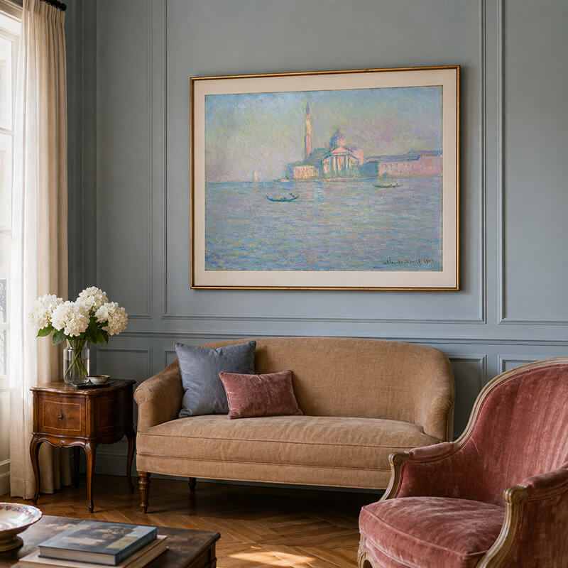
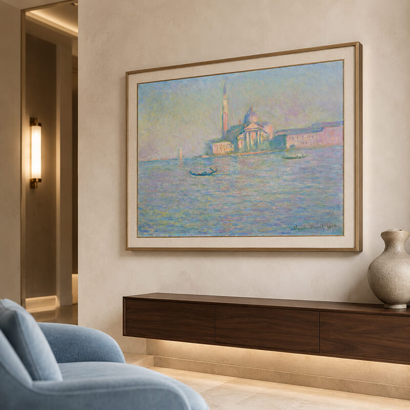
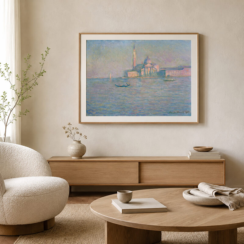
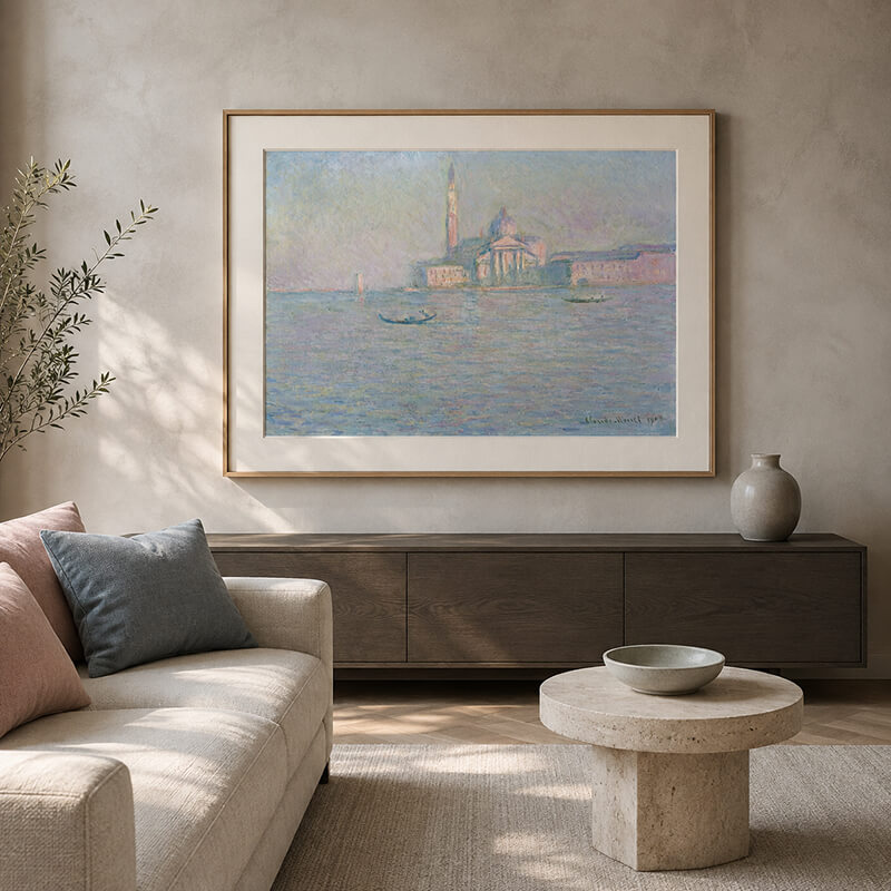
Few paintings translate atmosphere into interior language as naturally as Monet San Giorgio Maggiore wall art. Created from studies made during Claude Monet’s 1908 stay in Venice, the scene dissolves architecture, sky, and water into a gentle veil. As a result, it offers more than art-historical interest. It also provides a refined palette for calm, modern rooms.
Styling a Home with Claude Monet’s Venetian Light
Monet’s view of San Giorgio Maggiore feels both specific and dreamlike. The church remains recognizable, yet its edges soften within mist, reflection, and changing light. Therefore, the painting can introduce visual depth without overwhelming a carefully designed interior.
Why Monet San Giorgio Maggiore Wall Art Still Feels Modern
A Venetian Study Created in 1908
Monet visited Venice with his wife, Alice, between October and December 1908. According to Museum Wales’ collection record for San Giorgio Maggiore, he viewed the Palladian monastery from the Hotel Britannia. He developed the composition over several sessions, probably during the late afternoon.
However, Monet was not recording the building like an architectural illustrator. Instead, he studied how Venice’s humid air changed color, distance, and form. The Metropolitan Museum of Art’s overview of Monet’s Venetian campaign also shows how the artist explored several city views during this visit.
Why the Painting Works in Contemporary Interiors
The composition has a broad horizontal rhythm. Meanwhile, the bell tower provides a controlled vertical accent. This balance makes the image restful but never static.
Moreover, the soft palette complements wood, stone, linen, brushed metal, and plaster. Because the colors are restrained, the artwork can connect classical painting with modern wall décor without appearing forced.
The Aesthetic Core of San Giorgio Maggiore
Hazy Gradations of Blue, Violet, and Warm Light
The painting is built from short, layered strokes rather than hard outlines. Pale blue moves into lavender, muted green, soft pink, and small notes of warm gold. Consequently, the church appears to emerge from the atmosphere instead of sitting sharply against it.
The water is equally important. Its broken reflections repeat the colors above while loosening their structure. Therefore, the lower half of the canvas creates movement without visual noise.
The Quiet Effect of Low-Saturation Color
Low-saturation colors create less visual contrast than vivid primary tones. In an interior, this allows the eye to move gently across the room. The result often feels composed, spacious, and restorative.
However, calm does not mean dull. The subtle shifts between blue, violet, pink, and gold keep the surface active. For this reason, the artwork remains engaging at both close and long viewing distances.
Build a Restful Interior with the Monet Palette
Translate the Painting into Walls and Furnishings
A successful scheme should not copy every color equally. Instead, select one dominant neutral, one supporting color family, and a few small accents.
- Base colors: Use mist blue, pale gray-blue, or warm off-white on walls and large upholstery.
- Supporting colors: Add oatmeal, cream, light oak, or soft taupe through curtains, rugs, and furniture.
- Accent colors: Introduce dusty lavender, muted blush, or soft gold through cushions, ceramics, and metal details.
For example, a warm ivory wall can prevent the blue passages from feeling cold. Likewise, walnut furniture can ground the composition and give the room greater depth.
Room-by-Room Placement and Styling
Living Rooms and Entryways
In a living room, place the artwork above a sofa, console, or low cabinet. As a practical starting point, choose a framed width around 60–75% of the furniture below. This proportion gives the piece presence while preserving breathing room.
In an entryway, keep accessories restrained. For example, one ceramic vessel and a low stack of books are usually enough. If you are planning a broader project, our guide to selecting Impressionist artwork for interior spaces offers additional placement considerations.
Bedrooms and Studies
For bedrooms, pair the painting with linen, pale timber, and soft indirect lighting. Meanwhile, avoid highly patterned textiles near the frame. They may compete with Monet’s delicate brushwork.
In a study, the painting works well above a credenza or reading chair. Its horizontal format can visually widen a compact wall. For a warmer atmospheric comparison, explore our article on Monet’s Impression, Sunrise reproduction.
Select a Frame That Supports the Artwork
Modern Minimalist and Light-Luxury Rooms
Choose a narrow frame in champagne metal, brushed brass, pale oak, or dark walnut. For a stretched canvas print, a floating frame adds depth and keeps the edges visible. However, a paper print should use a mat and protective glazing.
Keep the frame profile slim. Otherwise, a heavy border may overpower the painting’s airy structure. A warm-white mat is usually softer than a bright white one.
French Vintage and Cream-Toned Interiors
An aged-gold wooden frame can suit French interiors, especially when its finish is matte. Alternatively, a gently distressed walnut frame provides warmth without looking ornate.
Nevertheless, avoid deep red-gold finishes or excessive carving. Monet’s palette needs light around it. Therefore, the frame should provide definition rather than become the main attraction.
How to Choose a High-Quality Monet Reproduction
Cotton Canvas or Fine Art Paper?
A cotton-canvas giclée print provides a woven surface and works well at larger sizes. It can also be displayed without glazing. By contrast, fine art paper offers crisp tonal detail and a more traditional works-on-paper presentation. However, it requires a mat and protective glass or acrylic.
Neither format is the same as a hand-painted oil reproduction. Therefore, buyers should confirm the production method before ordering. They should also review color proofs, edge finishing, stretcher quality, frame joints, and protective packaging.
For related designs and production options, browse our Monet painting reproduction collection.
Use Lighting to Preserve the Atmospheric Effect
A warm LED around 3000K can support the painting’s violet, blue, and gold notes. In addition, a high color-rendering light helps maintain subtle tonal differences. Angle the spotlight at roughly 30 degrees to reduce glare.
Avoid direct sunlight and excessive heat. If the work sits behind glazing, consider an anti-reflective surface. As a result, the image will remain readable from different positions in the room.
Let Monet’s Light Become Part of Daily Life
San Giorgio Maggiore succeeds in an interior because it offers both structure and softness. Its architecture anchors the wall, while its reflected light keeps the room open and calm.
Finally, choose a scale, frame, and material that match the surrounding space. Then allow the painting’s palette to guide a few thoughtful furnishings. Explore the full Monet wall art selection or contact our team for custom sizing and framing advice.