Creating Warm Balanced Interiors with Neutral Wall Art
Neutral wall art is a popular choice in modern home decor, using low-saturation shades such as black, white, gray, beige, and cream to create interiors that feel serene, sophisticated, and timeless.
The key interior design principle to rely on is not injecting random pops of bright color; instead, it comes down to intentional scale, tactile depth, and architectural balance. With a few deliberate styling choices, neutral wall art can transform an uninviting room into a serene, high-end sanctuary.
How to Select Textured Neutral Canvas Wall Art
The quickest way to make neutral decor look cheap is relying on flat, high-gloss paper prints behind reflective glass. Without rich color contrasts to catch the eye, a smooth surface simply recedes into an off-white wall until it practically disappears.
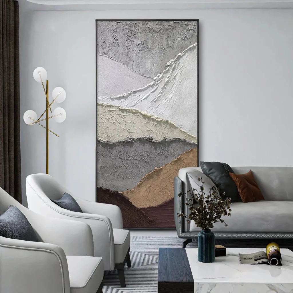
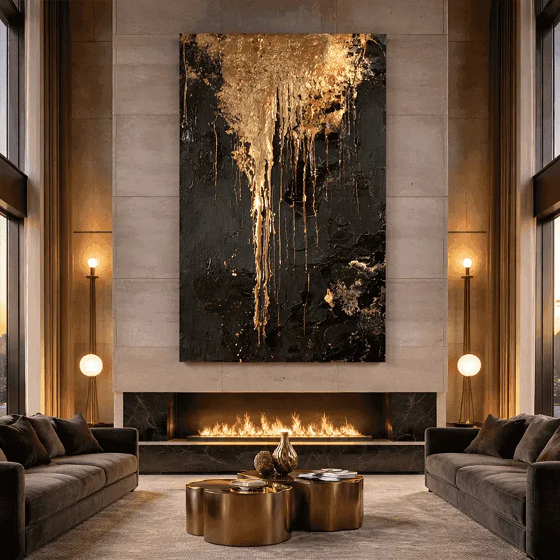
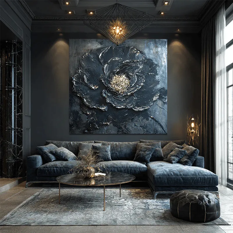
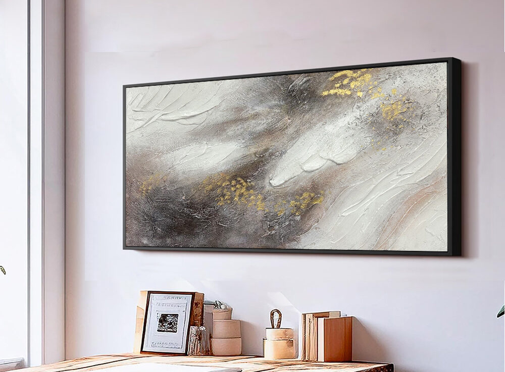
To bring life into a muted palette, tactile dimension must do the heavy lifting. Choosing neutral canvas wall art with visible brushstrokes, textured plaster, or heavy impasto allows the piece to catch natural daylight and directional lighting, creating soft shadows that evolve throughout the day.
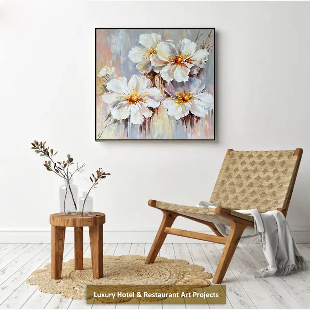
When selecting a neutral wall art canvas, consider an unframed deep gallery wrap or set it inside an ultra-slim, raw wood floating frame. This creates visual separation between the wall and the art, giving the piece a grounded presence without distracting from its organic texture.
Getting the Scale Right with Large Neutral Wall Art
When styling a wide, empty wall, an undersized frame is your biggest enemy. Because muted tones lack dramatic contrast, small frames tend to look like isolated patches lost in an open expanse.
Among the most effective wall decor ideas, choosing the right scale has one of the greatest impacts on how polished and balanced a room feels. When mounting art above an anchor piece like a sofa, sideboard, or bed frame, your large neutral wall art should span roughly two-thirds to three-quarters of the furniture’s width.
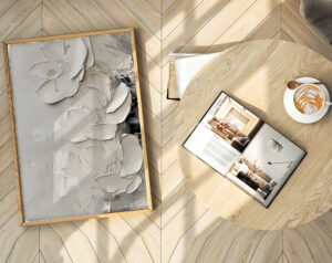
Beyond color harmony, hanging height is crucial. The Kansas City Art Institute hanging guide recommends using a center point of about 60 inches from the floor as a practical starting point. Above a sofa, leave roughly six to eight inches between the cushions and the artwork so the seating area feels visually connected.
Setting a Warm Tone: Choosing Neutral Wall Art for the Living Room
The living room is the conversational heart of the home, which means your art should never look like an afterthought hung in isolation. Every piece on the wall needs an architectural relationship with the textiles and surfaces surrounding it.
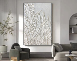
When curating neutral wall art for living room spaces, echo the subtle undertones found elsewhere in the room. A painting with creamy ivory and warm sand notes creates natural cohesion alongside an oatmeal linen couch, while touches of soft charcoal or umber within the piece subtly balance dark wood coffee tables or leather accents. Beyond color harmony, hanging height is crucial. Aim to keep the vertical midpoint of your frame at a standard eye level of 57 to 60 inches from the floor, leaving roughly six to eight inches of breathing space above the top of your sofa cushions so the seating area feels connected rather than disconnected.
Defining the Mood with Neutral Landscape Wall Art
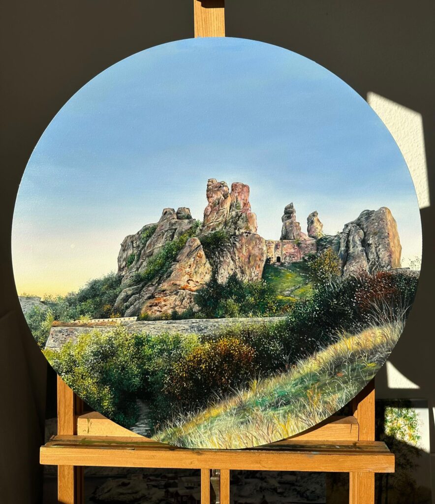
People typically select art subjects based on personal preference and the need for environmental harmony. In spaces designed for relaxation—such as the master bedroom or a cozy reading nook—landscape art featuring soft, neutral tones works wonders in setting the mood. Popular choices include misty mountain ridges, gently rolling sand dunes, or serene coastlines with understated palettes; these neutral landscape wall art pieces minimize visual clutter and evoke a sense of tranquility rooted in nature.
In contrast, busier transition areas like hallways or modern entryways often benefit from sharper lines. Balancing gentle landscape scenes with clean, architectural neutral modern wall art keeps the home feeling fresh, modern, and uncluttered as you move from one zone to the next.
Adding Personality with Abstract Neutral Wall Art
The decor market is crowded with flat, mass-produced digital prints that lack depth. Selecting expressive neutral abstract wall art requires an eye for authentic movement, negative space, and compositional weight.
High-end abstract neutral wall art relies on the interplay of raw materials—such as layered woven linen, subtle washes of earth tones, or asymmetrical geometric forms that invite curiosity without shouting for attention. By avoiding shiny, ornate composite frames in favor of understated matte black metal or natural oak, the focus remains entirely on the piece’s craft.