

Inside Monet’s Springtime: Camille, Color and Dappled Light
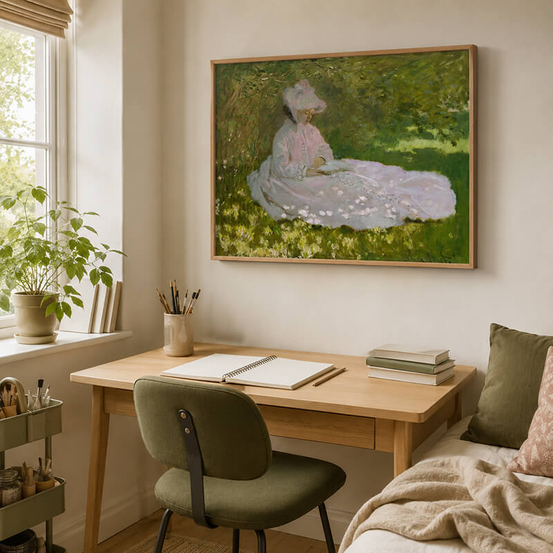
The Claude Monet Springtime painting captures a quiet moment beneath a canopy of sunlit leaves. Camille Monet sits reading on the grass, while scattered light moves across her pale pink dress and the surrounding garden. Beyond its immediate beauty, the painting reveals both a personal story and Monet’s developing approach to Impressionist light.
Camille Monet and the Garden at Argenteuil
Painted in 1872, Springtime shows Monet’s first wife, Camille, seated beneath lilac trees in the garden of their home in Argenteuil. The family had moved there near the end of 1871, seeking a quieter setting outside Paris.
According to the Walters Art Museum, which holds the original painting, the work belongs to a small group of compositions featuring Camille in the family garden. It was later exhibited at the Second Impressionist Exhibition in 1876.
Camille was more than a convenient model. She appeared throughout Monet’s early career and became closely connected with his exploration of modern life, domestic intimacy and changing natural light. Here, her lowered gaze and relaxed posture create an atmosphere that feels private rather than formally posed.
How Monet Created Dappled Light
The most striking feature of the composition is its dappled light. Sunlight passes through the foliage and breaks into small touches across the grass, Camille’s dress and the open space around her. Instead of outlining every leaf or flower, Monet uses loose, visible brushstrokes to suggest their movement and brightness.
The pale dress provides an ideal surface for this experiment. Soft pink, cream, and gray-violet passages shift between light and shadow, while touches of green connect the figure with the garden. As a result, Camille appears surrounded by nature rather than separated from it.
Monet also avoids treating shadow as a flat area of pure black. Instead, cooler greens, muted violets, and soft grays interact with pale yellow and warm cream. This approach gives the shaded areas depth while allowing the entire scene to remain luminous. Consequently, the garden seems to breathe, and the light feels temporary rather than fixed.
Bringing Springtime into Modern Interiors
The painting’s gentle palette continues to work beautifully in contemporary spaces. Olive green, blush pink, warm ivory, and natural wood can repeat its colors without overwhelming the room. Therefore, Springtime is especially suitable for reading corners, bedrooms, creative studios, and calm living areas.
High-quality reproductions and Impressionist oil paintings can also help introduce art-historical character into modern interiors. A slim walnut, natural oak or muted gold frame complements the painting while preserving its soft visual rhythm.
For a spacious feature wall, buyers searching for extra large wall art for living room interiors can use this composition to create a warm focal point. Its horizontal format works particularly well above a sofa, console or low bookcase, while its natural colors remain easy to coordinate with neutral furniture.
An Enduring Image of Spring
Springtime transforms an ordinary moment of reading into an enduring study of affection, color and passing light. More than a portrait, it preserves the feeling of one quiet afternoon in Monet’s garden.
What detail draws you in most—the tranquil figure, the soft pink dress, or the sunlight moving through the leaves? Share your impression or pass the article along to another art lover.