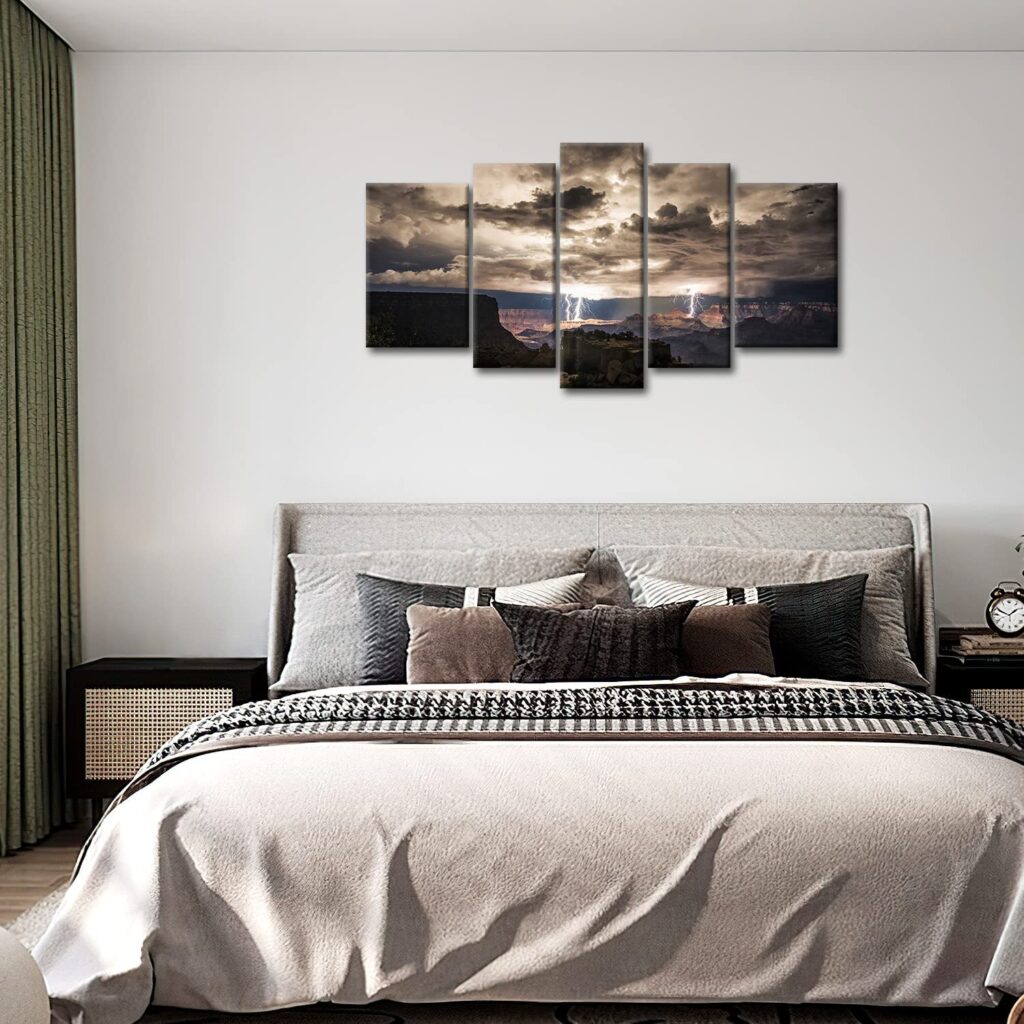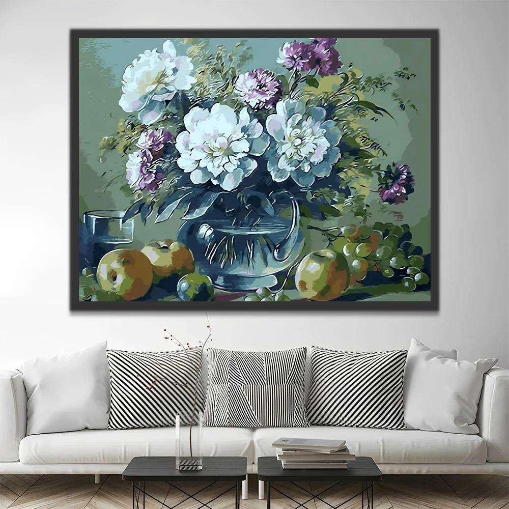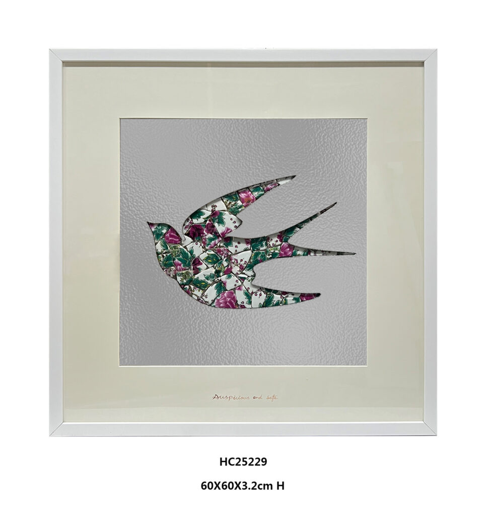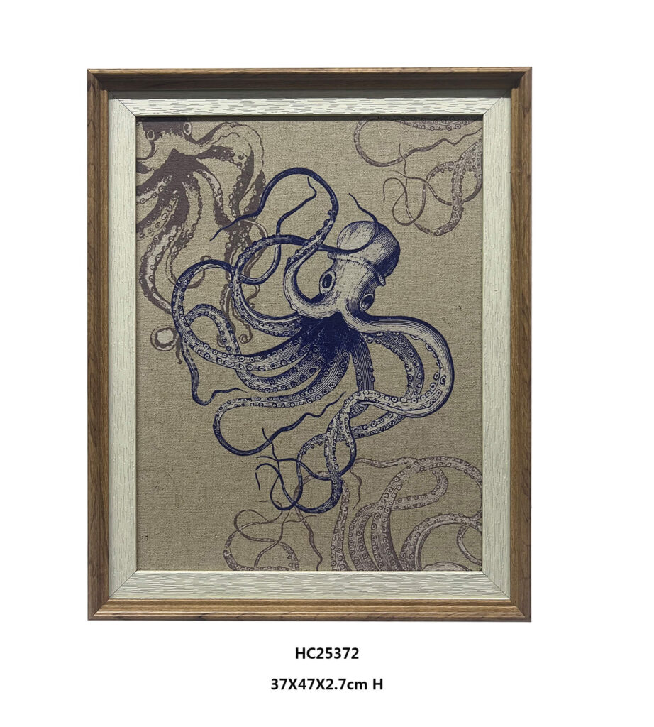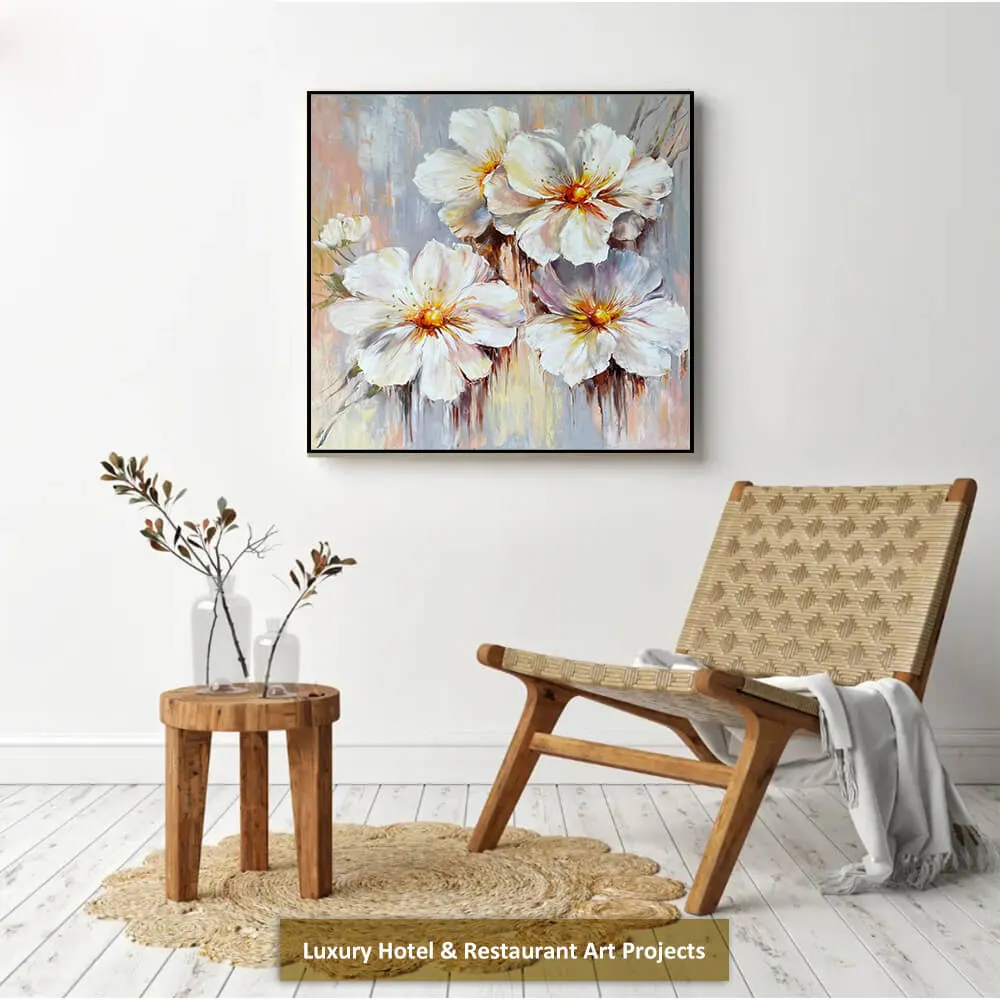
Good wall art does not ask every color, shape, and subject to compete at the same volume. A strong composition establishes a clear visual lead, then uses smaller details to create rhythm and interest. The 70/30 rule offers a simple way to plan that relationship.
What Is the 70/30 Rule in Art?
The 70/30 rule in art is a flexible design heuristic. It suggests giving about 70% of the visual area, color, or attention to the main element, while using the remaining 30% for supporting details, contrast, and accents. This approach helps a painting or wall-art arrangement feel organized without becoming flat or predictable.
The ratio is not a universal law of art, and artists do not need to measure every shape with a ruler. Instead, it provides a quick way to establish visual hierarchy. One subject, color, or structure leads the composition. The other elements support it.
The 70/30 Rule Is a Flexible Ratio, Not a Universal Law
The phrase “70/30 rule” has different meanings in different fields. It works more like a general way of thinking about priorities than one fixed formula.
- In styling, 70% of an outfit may come from simple basics, while 30% comes from a statement bag, shoe, belt, or accessory.
- In product planning, 70% of the process may focus on customer needs, while 30% keeps the company’s strategic direction in view.
- In time management, a person may reserve most of the day for high-value work and a smaller portion for routine tasks or maintenance.
- In AI workflows, AI can handle much of the repetitive work, while a person keeps responsibility for ideas, judgment, tone, and final editing.
All of these examples share the same principle: create a strong foundation first, then use a smaller portion to add direction and emphasis. In art, the foundation may be a dominant color, a main subject, a large area of negative space, or the overall scale of the wall-art arrangement.
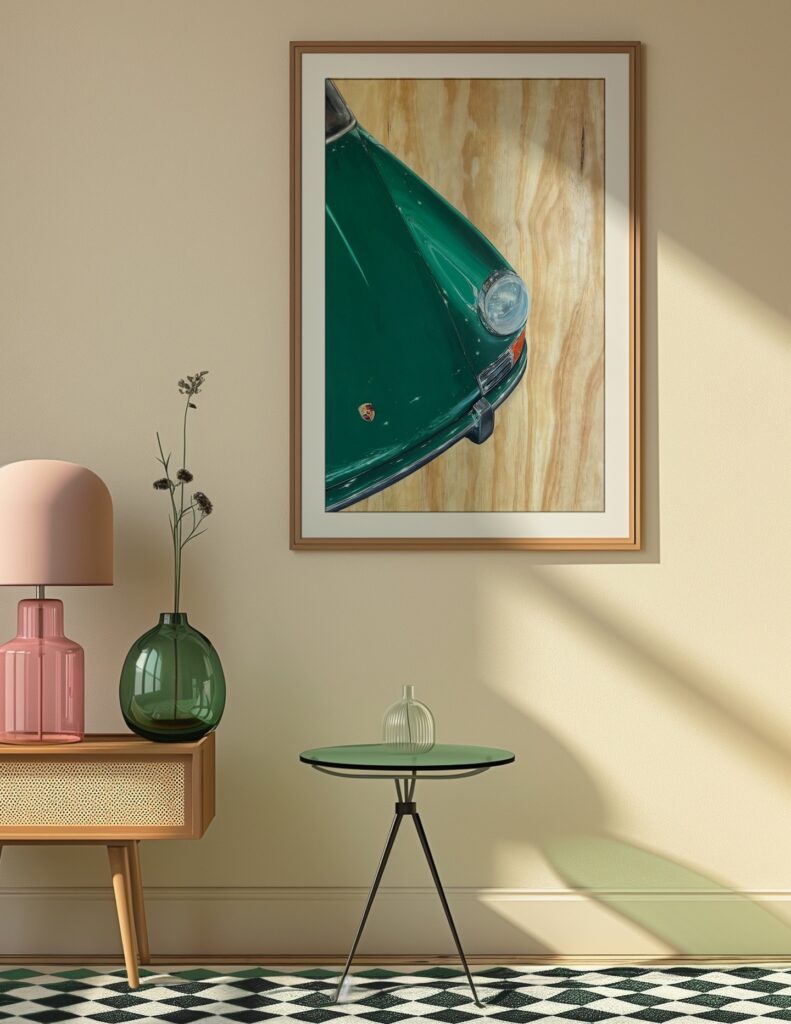
What Does the 70/30 Rule Mean in Art?
In visual art, the 70/30 rule helps answer one basic question: what should the viewer notice first?
The 70% portion establishes the overall mood and structure. It may include the background, the main subject, the dominant color family, or the largest shapes in the image. The 30% portion adds depth. It may include secondary objects, contrasting tones, smaller patterns, highlights, or decorative details.
This relationship gives the eye a clear path through the composition. Without a dominant element, everything can feel equally important. As a result, the artwork may look busy even when it contains only a few objects. With a clear primary and secondary relationship, the composition feels more intentional and easier to read.
Formal art education usually describes this idea through principles such as balance, emphasis, and proportion rather than through one universal 70/30 formula. For a useful reference, the MassArt Elements and Principles of Art vocabulary guide explains how artists use color, space, balance, emphasis, and proportion to organize a work.
Use a 70/25/5 Color Ratio in Art and Decor
One of the most practical versions of the 70/30 rule is the 70/25/5 color ratio. The final 30% is divided into a larger supporting color and a smaller accent color.
The dominant color takes up about 70% of the visual field. It establishes the overall atmosphere through elements such as the background, wall color, sky, large subject, or main color field.
The supporting color takes up about 25%. It adds depth and connects secondary elements such as furniture, foliage, shadows, patterns, or transitional tones.
The accent color takes up about 5%. It creates emphasis and directs attention through details such as a flower center, bright highlight, small geometric shape, metallic detail, or strong contrast. The supporting color and accent color together make up the remaining 30%.
The Dominant 70%
The dominant color should occupy the largest visual area. It does not have to be a bright or obvious color. Soft beige, warm gray, navy, ivory, and muted green can all serve as dominant colors. The important point is consistency. This color sets the emotional temperature of the artwork or room.
In a painting, the dominant color may appear in the background and repeat across the main subject. In a room, it may come from the walls, floor, and other large surfaces.
The Supporting 25%
The supporting color prevents the dominant color from feeling monotonous. It can appear in secondary objects, shadows, patterns, furniture, curtains, or smaller areas of the artwork. This color should relate to the dominant color while still creating enough contrast to separate the layers.
The Accent 5%
The accent color is usually the smallest area but often carries the strongest visual energy. A small amount of red, gold, cobalt blue, emerald green, or another high-contrast tone can attract the eye immediately.
The accent does not need to appear in only one place. Repeating it two or three times can help connect the composition. However, using too many bright accents can weaken the hierarchy because the viewer no longer knows which detail matters most.
Applying the Ratio to a Room
The same idea can guide interior styling. As a starting point, about 70% of the room can come from base colors on walls and floors, 25% from larger furniture and window treatments, and 5% from decorative accents such as wall art, cushions, vases, or small objects.
This is not a requirement to make the wall art physically tiny. A large artwork can still function as a 5% accent layer because its color or subject may occupy a small part of the room’s overall visual language. In a neutral room, the artwork may even become the main focal point while the surrounding colors remain quiet.
Apply the 70/30 Rule to a Painting or Wall-Art Composition
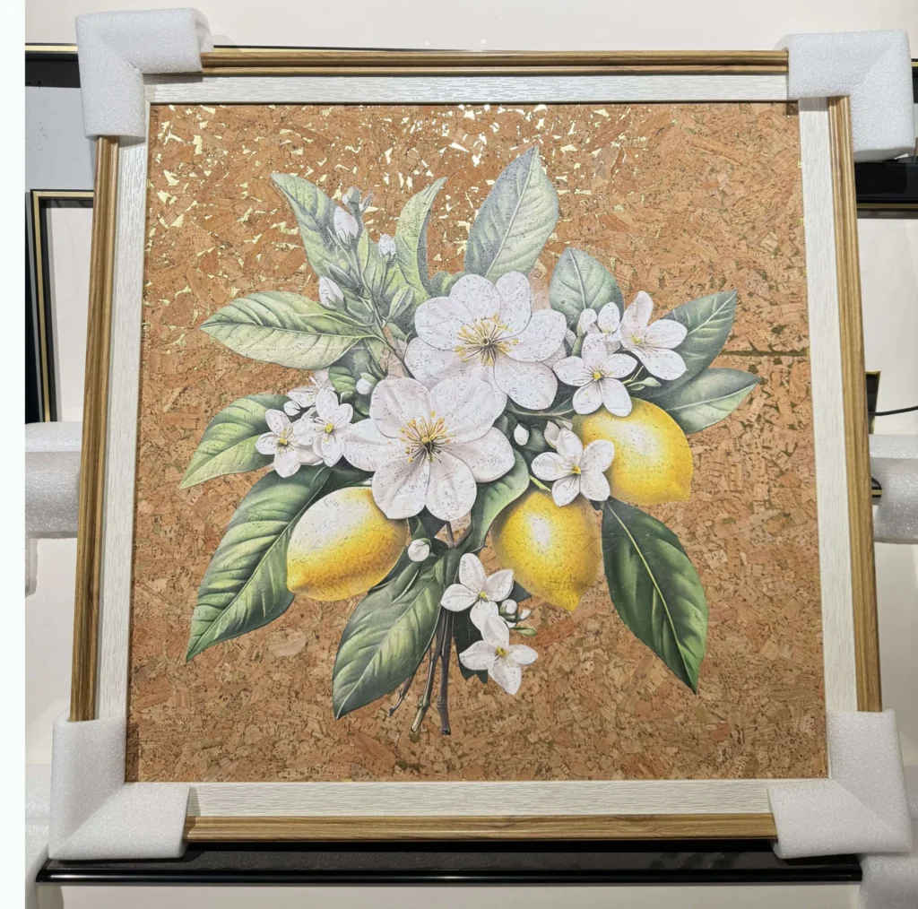
The rule also works with subject matter and detail. Imagine a botanical painting with a large group of leaves and flowers. The leaves, background, and broad color field may form the 70% foundation. Small blossoms, stems, shadows, and highlights can provide the remaining 30%.
This does not mean the smaller details are unimportant. They give the artwork character. However, they should support the main subject rather than compete with it.
When evaluating a composition, consider these questions:
- Is there one clear focal point?
- Does the background create enough space around the subject?
- Do secondary elements guide the eye back to the focal point?
- Are the strongest contrasts placed where attention is needed?
- Does the artwork still feel clear when viewed from across the room?
Remember that visual weight is not the same as physical size. A small dark shape can attract more attention than a large pale shape. Saturation, contrast, sharp edges, texture, and unusual placement can all increase visual weight. Therefore, the 70/30 rule should be judged by what the eye feels first, not only by how much surface area an element occupies.
Use 70/30 to Choose the Right Wall-Art Size
The 70/30 idea also helps when you choose wall art for a room. For a sofa wall, bed wall, console wall, or dining area, the complete artwork arrangement often looks balanced when its total width occupies about 60% to 70% of the available wall or furniture width.
Use this simple formula:
Available width × 0.60 to 0.70 = suggested total artwork width
Measure the finished outside width of the full arrangement. For a single framed artwork, include the frame. For a gallery wall, include the gaps between pieces and measure from the outside edge of the first piece to the outside edge of the last piece.
For example, if the usable wall width is 300 cm, a suitable artwork arrangement may measure approximately 180 to 210 cm wide. The final choice depends on the ceiling height, furniture scale, frame thickness, and amount of empty space around the display.
This measurement is not exactly the same as the color-based 70/30 rule, but it follows the same proportion principle: the wall art should have enough presence to anchor the area without filling every available space. For more practical measurements and placement ideas, read this guide to living room wall art size and placement.
Build Visual Hierarchy in a Wall-Art Arrangement
The 70/30 rule is especially useful when you hang several artworks together. The arrangement should have a primary visual statement and supporting pieces.
The main piece or main group may provide roughly 70% of the visual authority through its size, subject, color, or position. The remaining pieces can repeat a color, material, frame finish, or theme without competing for equal attention.
For example, a large abstract canvas can act as the focal point above a sofa. Smaller botanical prints can support it by repeating one or two colors from the main work. Alternatively, one large porcelain wall art piece can lead the composition while smaller decorative objects echo its gold, blue, or neutral tones.
The goal is not to make every piece identical. A balanced arrangement can include variety. The key is to give the viewer one clear starting point and enough breathing room to move through the rest of the display.
A Simple Five-Step Method for Using the 70/30 Rule
1. Identify the Main Element
Decide what should lead the composition. It may be a subject, a color, a large artwork, or a particular texture.
2. Establish the Dominant 70%
Build the background and larger areas around that main element. Keep the dominant color, form, or subject consistent enough to create unity.
3. Add the Supporting 25%
Introduce secondary colors, shapes, patterns, or artworks. Use them to create rhythm and connection without taking over the composition.
4. Reserve the Final 5% for Emphasis
Choose one or two accents that deserve attention. These may be bright colors, metallic details, strong shadows, or a small but meaningful subject.
5. Step Back and Judge the Visual Weight
View the artwork or wall arrangement from a distance. Ask whether your eye lands on the intended focal point. If every area demands equal attention, reduce contrast or detail in the supporting elements.
Common Mistakes When Applying the 70/30 Rule
The most common mistake is treating the ratio as a strict measurement. A successful artwork may use 80/20, 60/40, or an intentionally uneven composition. Personal taste, subject matter, and interior style all matter.
Another mistake is confusing physical area with visual importance. A small accent can dominate if it has strong contrast or intense color. Always judge the relationship by visual weight.
It is also easy to add too many accents. When every object has a bright color, decorative pattern, or bold frame, the 5% accent layer disappears. Choose fewer accents and repeat them with purpose.
Finally, do not choose wall-art size in isolation. The artwork must relate to the sofa, bed, console, wall width, ceiling height, and surrounding negative space. A technically correct percentage can still look wrong if the furniture scale does not support it.
Frequently Asked Questions
Is the 70/30 Rule an Official Rule in Art?
No. It is a practical proportion guideline rather than a universally accepted art law. Artists and interior designers can adjust the ratio to suit the subject, style, and space.
Is the 70/30 Rule the Same as the 60/30/10 Rule?
They are related but not identical. The 70/30 rule focuses on a broad relationship between a main element and supporting elements. The 60/30/10 or 70/25/5 versions divide the supporting portion into additional color or emphasis levels.
Can the 70/30 Rule Work with Maximalist Art?
Yes. Maximalist compositions can contain many colors and patterns, but they still benefit from a dominant color family, focal subject, or repeated visual structure. The ratio can be less literal and more about hierarchy.
Does the Rule Apply to One Artwork or a Gallery Wall?
Both. In one artwork, it can organize color, subject, and detail. In a gallery wall, it can help you choose a dominant piece and supporting works, as well as estimate the overall display width.
Final Takeaway
The 70/30 rule in art is a simple way to create order without removing creativity. Let one color, subject, or structure establish the main direction. Use the remaining space for contrast, rhythm, and carefully selected accents.
When you apply the idea to wall art, focus on visual hierarchy rather than exact mathematics. The best result is a composition that tells the eye where to look first, where to move next, and where to rest.