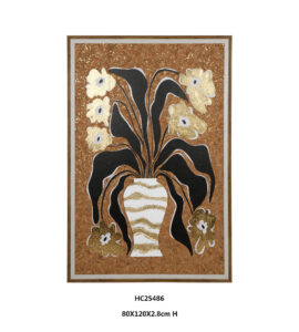
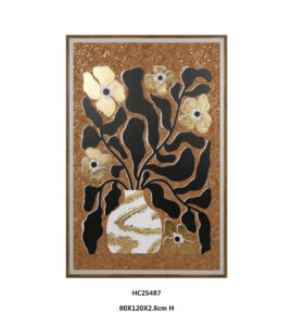
Golden flowers, sweeping black leaves, and a white vase stand out against warm brown cork. This black and gold floral wall art brings botanical shapes and layered surfaces together, creating a focal point with details that reward a closer look.
Botanical Contrast with a Warm Natural Backdrop
The appeal of these pieces comes from their balance of bold silhouettes and earthy color. Black foliage gives each composition structure, while gold accents catch the light. The white vase adds a bright resting point amid the branching stems.
A wood grain outer frame and light gray inner border finish the composition. Together, they connect the warm background with the crisp outlines of the flowers and leaves.
Two Floral Compositions with Distinct Character
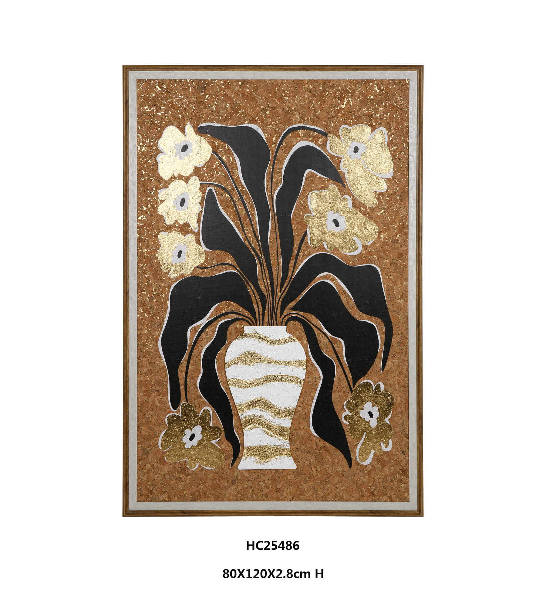
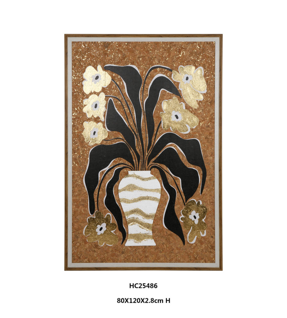
HC25486 features a tall white vase with flowing gold bands. Long leaves sweep outward and downward, while slender stems carry flowers toward the top of the frame. The arrangement emphasizes height and graceful movement.
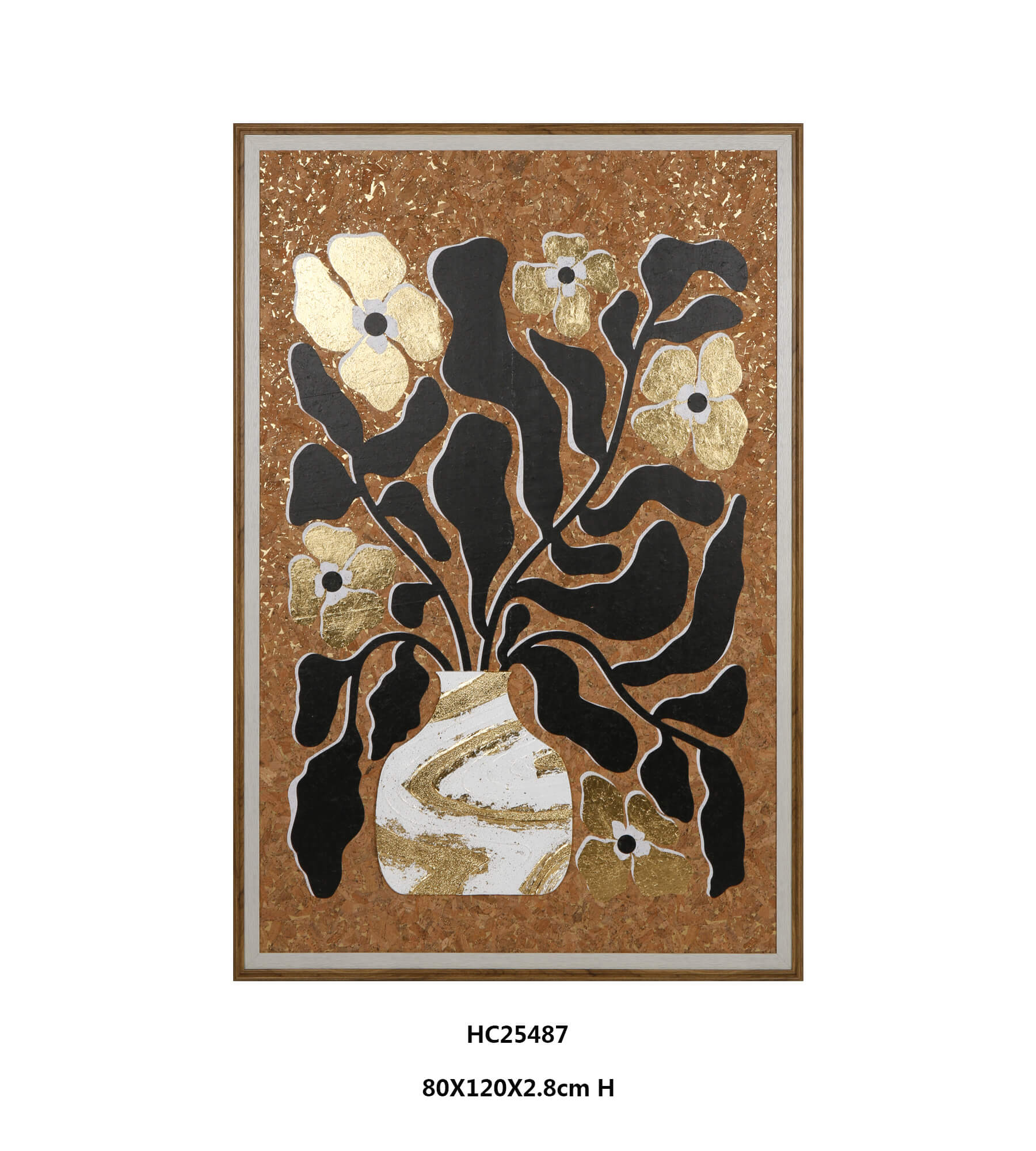
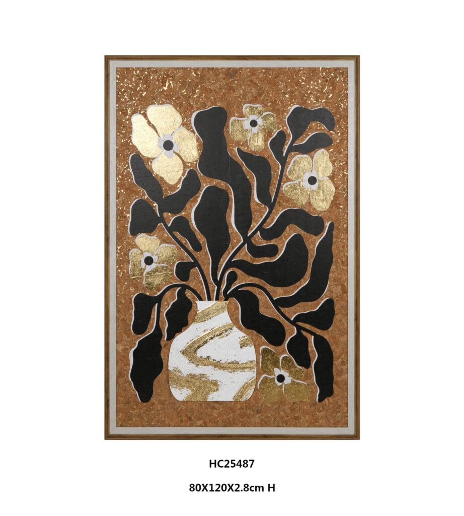
HC25487 pairs a rounded vase with broader, curling foliage. Its gold flowers sit among larger black shapes, creating a fuller, more graphic composition.
Choose either piece as an individual statement, or display them together for a coordinated arrangement with subtle differences in shape and rhythm.
Cork and Hand Applied Details
The pressed cork board gives the background its warm brown color and irregular grain. Derived from oak bark, cork brings a distinctive natural texture to the artwork. Its visible particles create an earthy backdrop that contrasts with the metallic flowers and bold black foliage.
Hand applied imitation gold leaf highlights the flowers and vase, with scattered fragments adding glints across the cork surface. Made from a copper and zinc alloy, this decorative leaf provides a metallic finish rather than genuine gold.
Layered impasto acrylic creates raised details in the black leaves and white vase. Pale outlines sharpen the foliage against the brown background, making this floral wall art engaging from across the room as well as up close.
A Cohesive Palette for Living Room Design
For a balanced living room design, draw on colors already present in the artwork. Cream upholstery can echo the white vase, while oak or walnut furniture complements the cork’s brown tones. A black lamp or side table repeats the foliage without introducing another color.
A few brass accessories can pick up the gold accents. Keep nearby patterns restrained so the leaves and textured background remain easy to appreciate.
This approach to interior design connects the artwork to the room through repeated colors and materials. Warm white, beige, or muted taupe walls provide a quiet setting for the contrasting botanical forms.
Single Statements and Paired Arrangements
A single vertical piece can anchor a console or define a reading corner. When pairing the two designs, align their top edges and leave an even gap to establish a continuous display.
Above a sofa, consider the full width of the arrangement, including the space between frames. As a starting point, the two thirds rule for wall art relates that combined width to the furniture below, helping the display feel proportionate.
Before hanging, mark the frame outlines with paper templates. Check the arrangement from the doorway and the main seating position to assess its scale.
Preserving the Layered Finish
The matte clear varnish provides a protective finish, but the raised surfaces still deserve gentle handling. Dust lightly with a soft, dry brush and avoid rubbing the metallic details. Keep the artwork away from persistent moisture and prolonged direct sunlight.
With its warm cork base, dimensional foliage, and metallic highlights, this black and gold wall art offers a distinctive focal point for a thoughtfully arranged room.