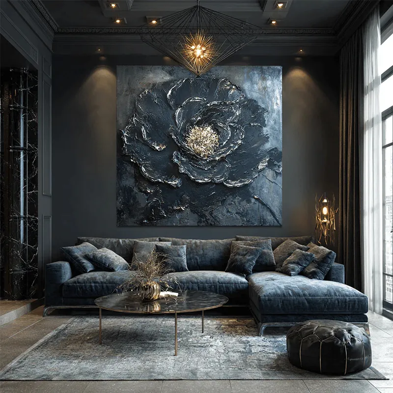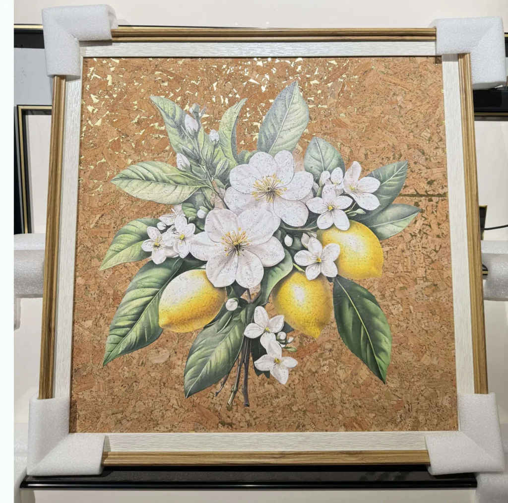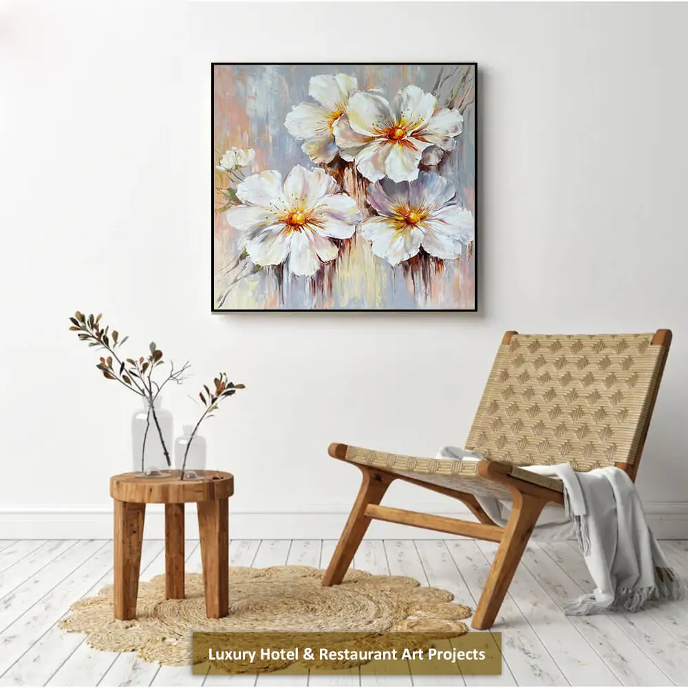
Blue wall art can bring color, depth, and personality to an interior without making the room feel overwhelming. From soft blue-gray designs to rich navy compositions, it works well with modern home decor, coastal rooms, minimalist spaces, and contemporary home design. The right choice depends on wall color, furniture scale, lighting, and the atmosphere you want to create.
Creating Calm Interiors with Blue Wall Art
Blue wall art is suitable for many interior design styles because the color can appear calm, elegant, dramatic, or refreshing. Pale blue creates an airy feeling, while navy and dark blue add contrast. With the right frame, size, and placement, blue artwork can become a balanced focal point in both residential and commercial interiors.
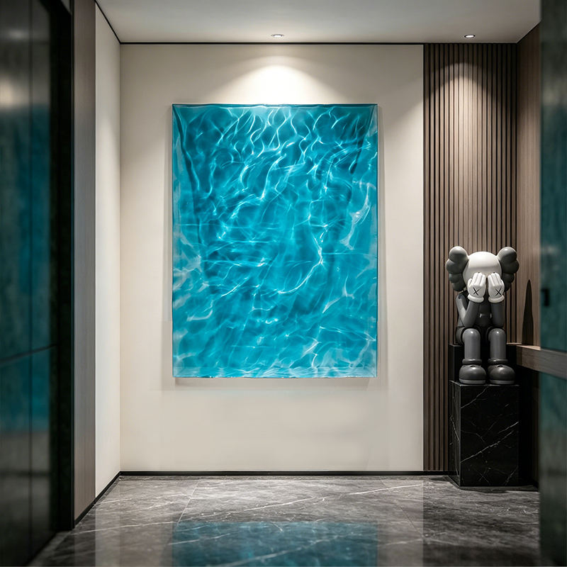
Choosing Wall Art for Blue Walls
Wall art on blue wall surfaces should create enough contrast to remain visible. Light blue or blue-gray walls work well with white frames, natural wood, cream backgrounds, and artwork that includes darker blue details. These combinations keep the room bright while adding visual depth.
For deeper blue walls, choose artwork with white, beige, gold, or light gray elements. A lighter frame can separate the artwork from the wall and make the composition stand out more clearly. Meanwhile, light-colored furniture can prevent the overall space from appearing too dark.
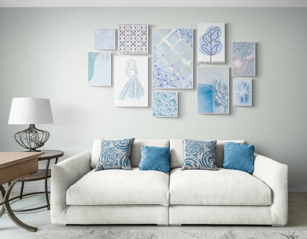
Before selecting a large piece, measure the wall and the furniture below it. The artwork should support the surrounding layout rather than appear too small or disconnected. For a more precise proportion guide, read our 2/3 Rule for Wall Art Size and Placement Guide, which explains how to estimate artwork width and hanging position.
Abstract Blue Artwork for Contemporary Interiors
Blue abstract wall art introduces movement through expressive brushstrokes, layered tones, and fluid shapes. A combination of navy, cobalt, pale blue, black, and white can become an eye-catching focal point in a modern living room, bedroom, office, or hotel lobby.
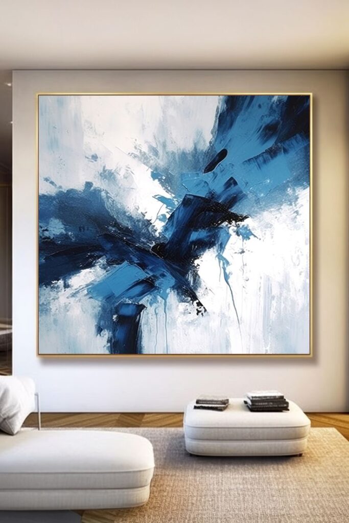
Abstract artwork does not need to match every decorative item exactly. Instead, select one or two colors from the painting and repeat them through cushions, rugs, vases, or curtains. This approach creates a coordinated look while keeping the home decor natural and flexible.
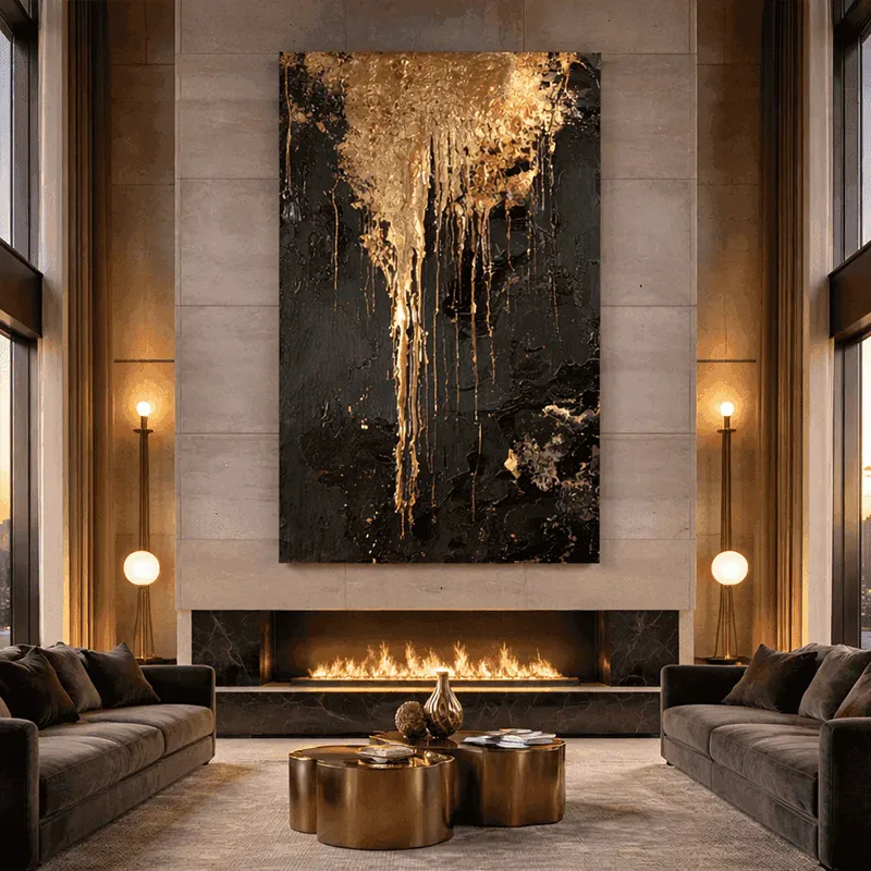
Large abstract canvases are especially effective above a sofa, fireplace, or sideboard. Textured surfaces and visible brushwork can also add depth to rooms that feature smooth furniture and simple architectural lines.
Styling Blue Artwork in the Living Room
Blue wall art for living room spaces should relate to the size and position of the main furniture. When artwork is placed above a sofa, its total width often looks balanced when it measures approximately 60% to 75% of the sofa width.
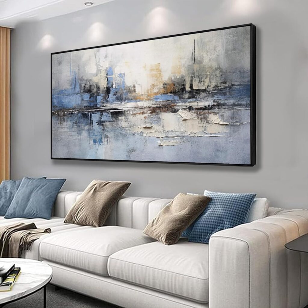
A wide horizontal canvas suits a long sofa, while a vertical painting can emphasize ceiling height or fill a narrow wall. Leave enough space between the furniture and the artwork so the arrangement feels connected without appearing crowded.
The colors in the painting can be repeated through cushions, rugs, curtains, or small decorative objects. This creates a more complete living room design and prevents the artwork from looking disconnected from the rest of the space.
Readers comparing different sizes, orientations, and materials can continue to our Wall Art for Living Room Size Style and Placement Guide for more detailed planning advice.
The Refined Appeal of Navy Tones
Navy blue wall art brings a calm and sophisticated quality to an interior. It works particularly well with cream upholstery, warm brown leather, natural wood, brass accents, and soft gray walls.
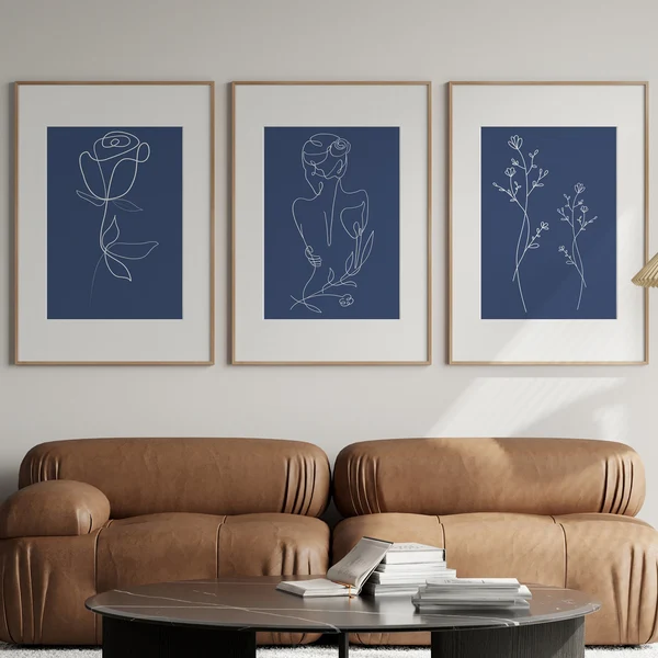
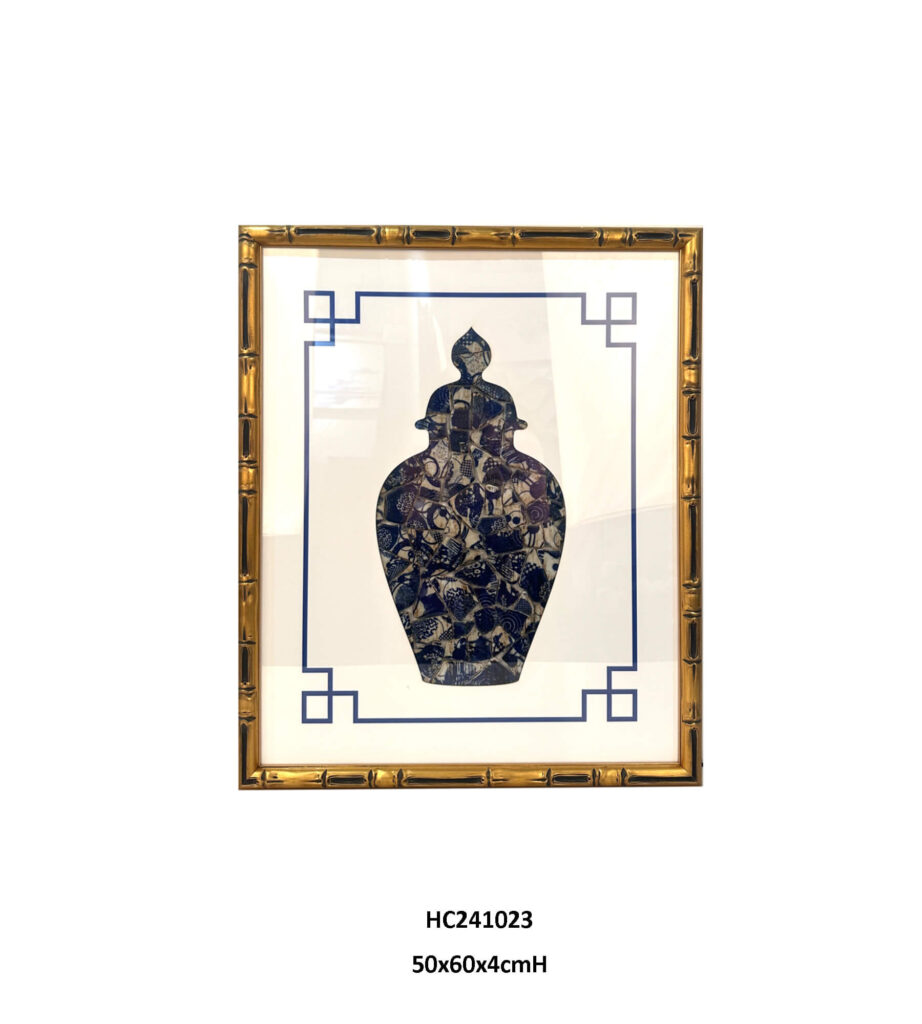
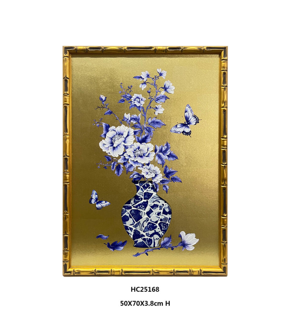
Navy artwork does not always need to be dramatic. Simple line drawings, geometric forms, and botanical designs can create a lighter appearance, especially when they are presented with a white border or a slim frame.
This color suits modern, transitional, and contemporary home design. It can also be used in dining rooms, bedrooms, offices, boutique hotels, and reception areas where a refined atmosphere is important.
Natural Balance with Blue and Green
Blue and green wall art creates a fresh and natural color combination. Blue brings a sense of calm, while green introduces an organic quality that works well with plants, wood, linen, rattan, and other natural materials.
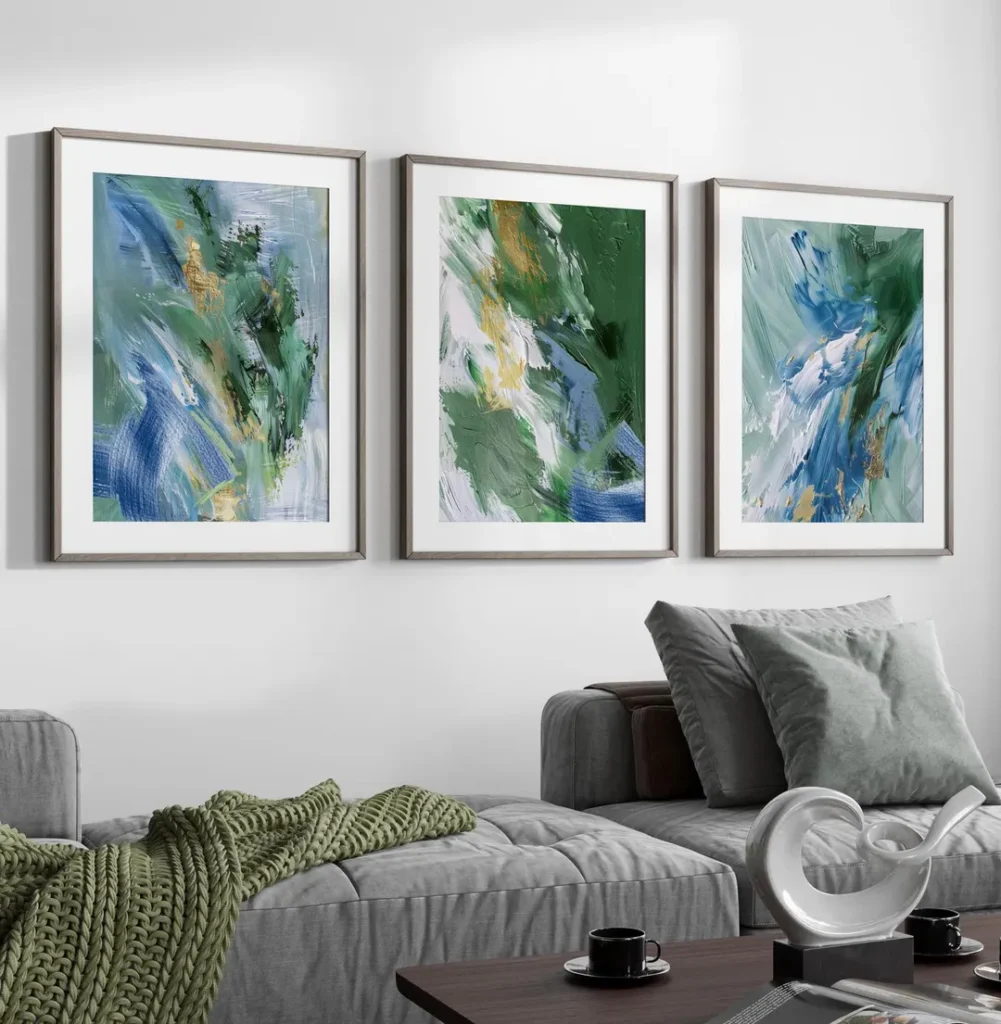
Sage green and soft blue create a quiet atmosphere for bedrooms and living rooms. In contrast, emerald, teal, and deep blue produce a stronger contemporary effect. To keep the palette balanced, choose one dominant color, one supporting color, and a neutral background.
Readers who want to compare related tones before selecting cushions, rugs, or curtains can use the Adobe Express color wheel tool. It includes analogous and other color harmony options for building a more coordinated interior palette.
Creating Depth with Dark Blue Artwork
Dark blue wall art adds depth and contrast, especially when displayed against white, pale gray, beige, or light wood surroundings. It is a strong choice for large empty walls, but the room should have enough natural or artificial lighting.
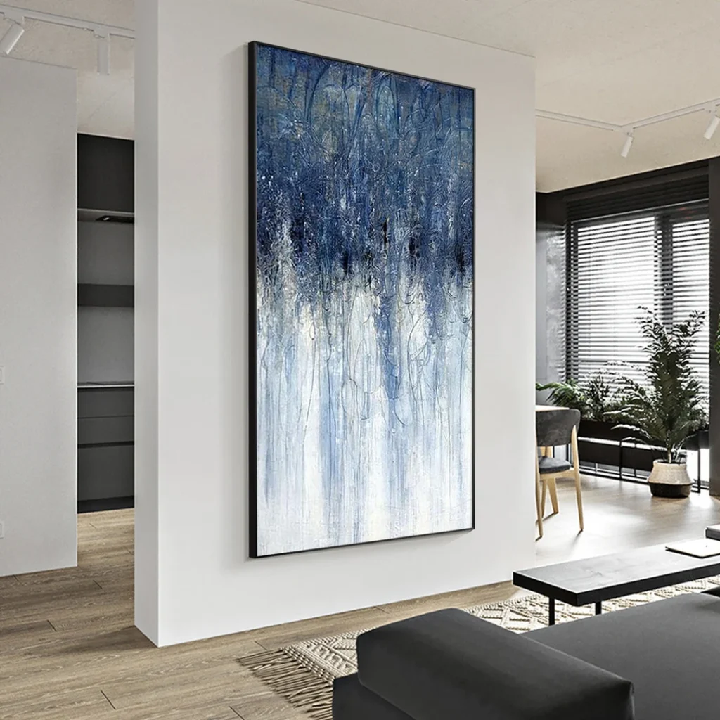
A dark blue painting with white or pale blue areas can prevent the artwork from feeling too heavy. Vertical designs suit narrow walls, while large horizontal pieces work well above sofas, sideboards, and console tables.
Dark blue artwork complements modern, industrial, minimalist, and contemporary interiors. To maintain balance, combine it with lighter fabrics, open space, and simple accessories. This allows the artwork to remain the main focal point without making the entire room feel dark.
The best blue wall art choice depends on more than color alone. Consider the wall tone, room size, furniture proportion, lighting, frame material, and existing home decor. With the right combination, blue artwork can add calm character and lasting style to residential and commercial interiors.